
Visualizing the Egyptian Revolution
Updated: 2011-02-28 13:43:58
 Two visualizations strive to shed light upon the Egyptian uprising that began on 25 January 2011 and demanded the overthrow of the regime of Hosni Mubarak. While they take a different view, both pair the happenings with the reactions of people on the web.
 Background The Statistical Office of the Free Hanseatic City of Bremen is responsible for providing the official statistics for the city of Bremen. Its main task is collecting data, processing, evaluation and publication of more than 200 statistics. The data relates to demographic, social, economical and ecological factors. According to Barbara Rosel who works in [...]
 I am very excited — no, I am thrilled to be speaking at this year's SXSW Interactive! Invited by the good folks at JESS3, I will join Adam Bly of Visualizing.org, Eric Friedman of Foursquare and our moderator Robin Richards on the panel entitled Social Media Data Visualization: Mapping the World's Conversations.
 Fizz is a social network visualization that provides a playful view on your own social graph and what's currently happening. It's one of the first two projects of the new visualization super group called Bloom.
 The list of one-off applications that visualize your digital life, whether it be your Twitter feed, Facebook updates, or Foursquare checkins, has been growing for a short while. Ben Cerveny and Tom Carden, both Stamen Design alumni, aim to take this idea to the next level with Bloom, with elements of game design. Our mission [...]
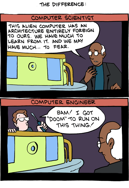 It's Saturday Morning Breakfast Cereal! Though jokes aside, Computer Science vs. Computer Engineering is often a tough choice to make, but here are some ideas for figuring out the subtle differences between those programs.
Related posts:Choosing between Computer Science and Computer Engineering
It's Saturday Morning Breakfast Cereal! Though jokes aside, Computer Science vs. Computer Engineering is often a tough choice to make, but here are some ideas for figuring out the subtle differences between those programs.
Related posts:Choosing between Computer Science and Computer Engineering Background The Pan American Health Organization (PAHO) is an international public health agency with more than 100 years of experience in working to improve health and living standards of the countries of the Americas. It serves as the specialized organization for health of the Inter-American System. It also serves as the Regional Office for the [...]
 Daniel Huffman gives us an alternative view on how to look at rivers: Using the analogy of urban transit maps, he achieves a high level of abstraction an thus gives a clear overview over relationships and hierarchies.
 Random Number Multiples debuts with two silk screened data visualizations by Jer Thorp and two abstract compositions by Marius Watz.
 Background The Suffolk Observatory is a partnership between Choose Suffolk, Suffolk County Council, Suffolk’s District and Borough Councils, NHS Suffolk and Suffolk Police. It is the home of data, statistics and reports about Suffolk provided by partner organisations. Data is presented around the key themes of education and skills, economy and employment, health and care, [...]
 Investing time and effort in developing a local information system or community information system might seem like the number one priority but there’s no point putting in the hard work if no-one knows it’s there. In December 2010 there were 255 million websites and 21.4 million were added in 2010 alone. So the valuable insight [...]